
Archive for September 2015
» The Talk Show #130: A full Canseco
I join John Gruber on this week’s episode of The Talk Show to discuss this week’s Apple event, round versus square smartwatches and José Canseco.
» Enabling other uses
In response to my post on square versus round watch faces, Abdel Ibrahim agrees, although he hates the Modular face, which I can understand. He also makes a point I hadn’t considered:
This is also why I think round, in the long term, is likely the wrong choice if you’re really trying to push the needle forward. Sure, round is a tad nicer looking when compared to square and we all know that if Apple built a round smartwatch it would be beautiful, but the problem is about information and glanceable data. In 5-10 years, are we really going to be using watches to tell time? Will that be even 1/4 of the reason we wear them? It’s hard to say, but again, I look at the iPhone and ask myself “How often do I make phone calls?” Answer: Rarely.
I have to think telling time will still be a core feature of a watch, even a smart one. The phone use of the iPhone is a bit different in that I never liked talking on the phone and the iPhone enabled means of avoiding that while on the go, like texting and email (you could do those on previous phones, of course, but it was not a good experience). I’m not sure how I can avoid needing to know what time it is. But he’s probably right that, ultimately, smartwatches will be used primarily for other things. So tying their UI to something defined by the sweep of hands doesn’t make a lot of sense.
» Turning This Car Around #76: Nobody Has Sex in Pennsylvania
This week on America’s sexiest dadcast we tell our car stories and Lex talks about the wild time he had at Dutch Wonderland.
» It doesn’t make sense
Jony Ive quoted in The New Yorker back in February:
For the watch, it was a year before Ive settled on straps that clicked into slots. Ive later tested watchbands by wearing them outside the studio with other watches. The shape of the body, meanwhile, barely changed: a rectangle with rounded corners. “When a huge part of the function is lists”—of names, or appointments—“a circle doesn’t make any sense,” Ive said.
I think he’s right. It doesn’t make sense. And, yet, what is the primary interface for contacts on the Apple Watch?
It’s just weird.
(Via Yoon Jiman)
» SALE: The Visual Guide to Minecraft
Is your child shuffling sadly around the house because school’s started again? Well, why not show them you care by buying them a Minecraft book? Like, say, one I co-wrote?
(Eh, I’ve written worse pitches.)
Now through September 9th, you can get The Visual Guide to Minecraft for 35 percent off! It’s 50 percent off if you buy two. Oh, and did I forget to mention there’s free shipping? THERE IS FREE SHIPPING!
Use code “LD2015” to save.
Do it for the kids. Or for yourself. What do I care?
The watch face wars
If you’re using a round Apple Watch face you’re living a lie.
Awww, yeah, it’s on.
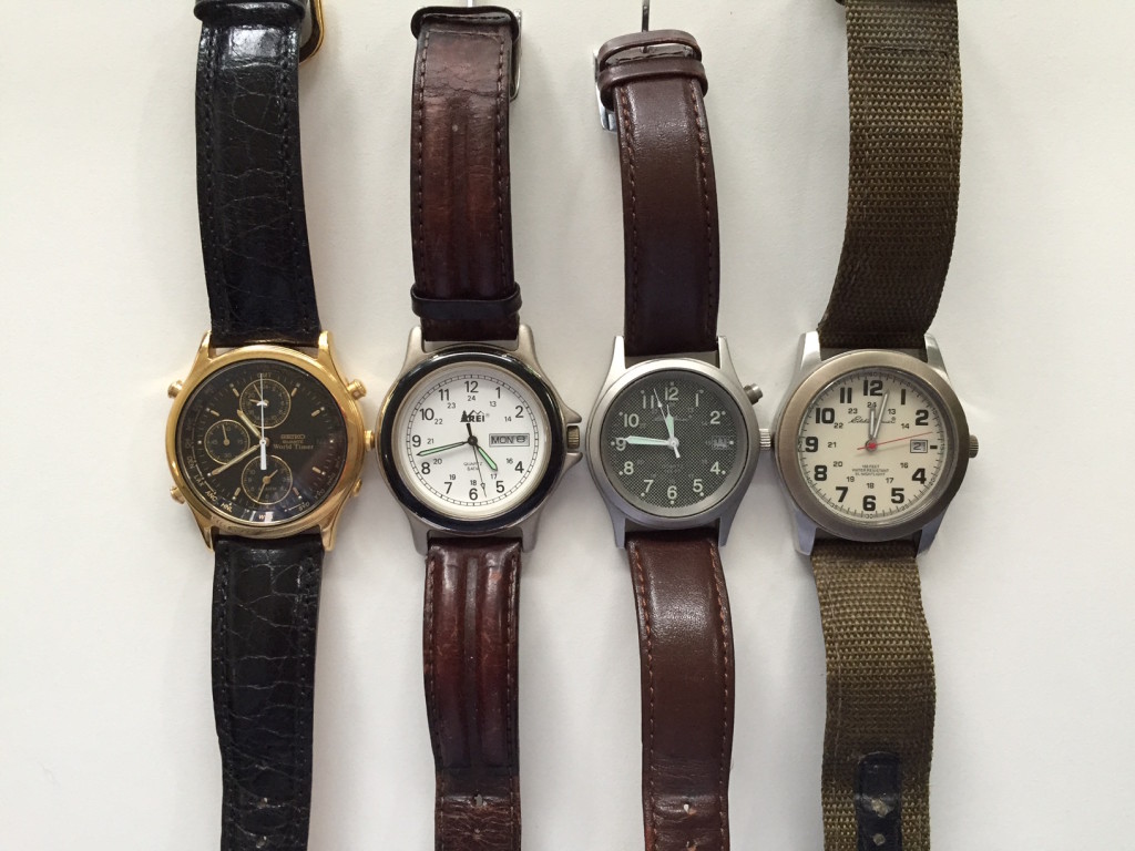
Up until a few days ago I had been using the Utility face on my Apple Watch which I like well enough.

It reminds me of the watches of yore I wore before the smartwatch revolution took off.
But now we are all wearing smartwatches. We must put away the analog faces of our childhood.
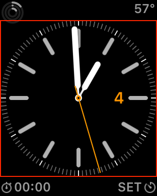
OK, my impetus for changing was actually just the date. Because my reading vision isn’t what it used to be and the fact that you can’t change the size of the text in any of the complications, I sometimes had trouble reading the date on the Utility face and others. Also, whenever it’s close to 15 minutes past the hour (see the first image), you can’t read the date at all because it’s covered by the minute hand. I’m a little surprised Apple didn’t think around this problem somehow. On a watch with physical hands, you can usually tilt it to see the date. Seems like this would be a good use of parallax on the Watch, but perhaps it doesn’t have the graphical capabilities to pull that off.
At any rate, I have switched to a customized implementation of the Modular face.
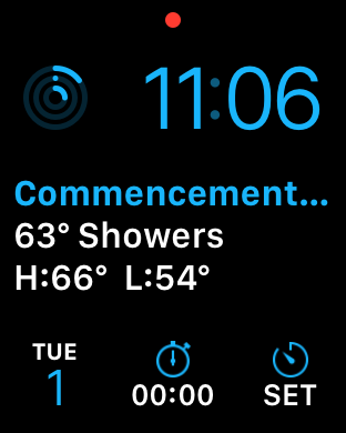
I can read the date now because this face’s complications are larger and I get more information with this face than any other. It does kind of scream “SMARTWATCH!” which at first I was uncomfortable with, but I’m coming around to the fact that maybe that’s OK or even as it should be. I do actually own a smartwatch and it’s not like a round face is fooling anyone. Also, I want to be able to get all the utility out of it I can. This face allows for the time and five complications, which is the most allowed. A few other faces will do that many, too, such as Simple and Chronograph, but you can get more out of Modular. Simple has a larger date number than Utility, but it still gets covered by the minute hand. Adding insult to injury, Chronograph’s hands are faux hollow. They look like white wire frame hands, but they’re filled in black. While the bottom row of complications is still just small squares on the Modular face, they’re the larger of the small square complications. Putting the a complication in the middle provides added information. For the weather, it adds the location, current conditions and the daily high and low. The default is the date which shows your scheduled items for the day. I’d rather have the weather because, as my fellow podcast hosts can attest, I never schedule anything.
While I feel like it might be time to embrace the smartwatchiness of the Apple Watch, Lex Friedman once pointed out to me part of the value of the circular watch face is that, despite being an anachronism, it makes it easier to visualize time. The sweep of the hands describes the passage of time in a way a strictly numerical face doesn’t. Past and future times are visible giving you a sense of where you are in the day. The Solar face does do that very well, but it doesn’t currently support complications.
Despite that caveat, because my watch is square, I feel like maybe the face I use should not try to deny the Watch’s physical design. Some of the circular Apple Watch faces make use of the full face by putting complications in the corners. But because the Watch is taller than it is wide, the complications on some circular faces don’t even cross the square defined by the circle.
Of the other smartwatches I’ve seen to date, I think only the Samsung Tizen-based Gear S2 is actually nice looking. In fact, I’d got so far as to say it’s probably the best looking thing I’ve ever seen from Samsung. (I am unclear, however, if it lets you skeeve on women.) Unlike the LG Watch Urbane which seems to be a watch made with poor materials trying to be a fashion watch, the Gear S2 seems to have a good sense of what it is. The low-end one looks like a Swatch. The higher-end one, a decent $80 watch. Most importantly, it’s smaller than either the LG Watch Urbane or, Jesus, the Moto 360 which is a veritable oil can of a watch.
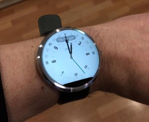
[Added 9/6/2015: There is a new version of the Moto 360 since the one I’m wearing above and it is considerably smaller. It’s still just a section of a cylinder with a band stuck on it and looks like crap to me.]
The Gear S2 is very comparable in size to the 42mm Apple Watch. The rotating bezel is a clever solution to the navigation problem (one that obviously wouldn’t work on the Apple Watch and nicely sets it apart from it). There’s so much we don’t know about it yet, of course, most notably the price. But it seems like exactly the kind of watch that most wearers of analog watches will be comfortable with.
That’s not very forward-thinking, though. I think there’s a ridiculous fetishization of circular watches going on.
Android Wear Watches Look More Like Actual Watches
It’s as if square watches never existed. Also, guess what, the Apple Watch is an actual watch. The reason most analog watches were round is not because round watches are better or because square watches can’t be stylish. It’s simply because the motion of the hands describes a circle. That’s all the space that was ever needed for the device to fulfill its most basic function. Because that shape is so tightly suited to that particular function, it’s decidedly at odds with adding functionality to it. Thus we have the date being blocked by the hands for about five minutes of every hour. A tricked-out watch like a chronograph suffers from almost all of those added features being blocked by the hands at various times, making them unusable.
Wired said about the Gear S2: “It’s a smartwatch that wants to be a normal watch.” That’s not actually a good thing. When you’re entering a new era, you shouldn’t hamstring it by tying it to the functional requirements of the past. And there is a very good argument to be made that, with one possible exception that no one is taking advantage of yet, square faces are better for digital displays of information. They’re certainly easier to code for.
Apple’s faces need work, however. I would like to see a little more rethinking of the watch face, to provide one with a more fluid representation of time that makes better use of a square. Maybe something like the Solar face, but without so much unused space.
Samsung made a nice looking watch. But the reason it looks nice to us is the same reason cars that looked like horse-drawn coaches probably looked nice to people in the late 1800s. It’s just what we’re used to. It’s time to rethink that.
» The Rebound #50: I’ll Never Love a Phone Again
Guy English joins Dan and me to talk about a new Apple TV, remotes and all the phones I’ve loved before.
» I want my iPad TV
As far as the possibility of an iPad Pro being announced next week, I think Jason Snell’s staid analysis is worth taking to heart. Given the slate of things now being floated for next week, it seem unlikely that it’ll be all of them and the iPad Pro seems the most likely to not make the cut to me. Still, can’t rule it out.
Given the recent tablet activation numbers in the enterprise, it’s certainly possible Apple might be trying to target this toward corporations, but my interest in a larger iPad is strictly for watching mah shows. I would say the vast majority of my movie and “television” watching happens on the iPad now, often when cooking or exercising. Personally, I’d rather have an iPad TV than an iPad Pro. Remember under-counter televisions? Or portable TVs? My iPad is what those always wanted to be when they grew up. Now they’re dead. Very sad.
A new Apple TV may inspire me to go back to the couch. But given my current iPad use cases, I’m not sure that’s necessarily the best thing.